WPF Date Range Double Slider Control (Part 2)

As I mentioned in my introduction to this series, I’m going over various aspects of how I implemented a control that allows a user to choose a DateTime range using a double slider control.  In Part One, I covered the basics of what I did to the control templates, put the slider together and showed the IValueConverters I used to handle the conversions from doubles to DateTime and doubles to TimeSpans.  In this article, I’ll be talking about what I did to keep the upper value and the lower value sliders from crossing each other.  The source for the control and a sample project can be found at CodePlex

My first thought doing this was to play it simple and bind the lower slider’s Maximum to the upper slider’s current value and the and the upper sliders Minimum to the lower’s current value.   While this seemed logical to me, when I implemented it, it put the two sliders on two totally separate scales and it failed miserably.  Not only were the sliders able to cross, since the scales were constantly changed, while I would move the lower slider, the upper slider would be moving (and not changing value).

My second attempt was much better, but still didn’t work as expected.  In this attempt, I subscribed to the ValueChanged event for each of the sliders.  In these event handlers, I had a piece of code as shown in “Attempt 2:  Fail” that was setting the slider controls values so they wouldn’t cross each other (for long) and then setting dependency properties (UpperValue and LowerValue) to those upper and lower values.  This failed because I wasn’t setting the upper slider’s value to something greater than the lower slider’s value until after this code ran.  To a user, this would be acceptable, you can’t actually see the values cross.  However, I was using this to help zoom in and out of a charting control  and once they crossed, even for a few milliseconds, the charting control would blow up on me.  It was quite messy…line fragments, points, and data everywhere.

Attempt 2: Fail
  1. private void LowerSlider_ValueChanged(object sender, RoutedPropertyChangedEventArgs<double> e)
  2. {
  3.     UpperSlider.Value = Math.Max(UpperSlider.Value, LowerSlider.Value + oneSecond);
  4.     LowerValue = new DateTime((long)LowerSlider.Value);
  5.     UpperValue = new DateTime((long)UpperSlider.Value);
  6. }


So, finally, my 3rd attempt I hit gold.  Why was I setting LowerValue and UpperValue be set by the sliders when I was also setting them in the ValueChanged events?  So I changed my bindings in the sliders to OneWay bindings so I have complete control of the range values and the sliders can suggest was my new UpperValue and LowerValue should be, but I get the final decision in my event handlers.  In my event handlers, I check if the slider values have passed each other and set the dependency properties to appropriate values that make sure that the UpperValue is greater than the LowerValue.

Slider Control Template
  1. private void UpperSlider_ValueChanged(object sender, RoutedPropertyChangedEventArgs<double> e)
  2. {
  3.     LowerSlider.Value = Math.Max(Math.Min(UpperSlider.Value oneSecond, LowerSlider.Value), Minimum.Ticks);
  4.  
  5.     var _upperValue = new DateTime((long)UpperSlider.Value);
  6.     var _lowerValue = new DateTime((long)LowerSlider.Value);
  7.  
  8.     if (UpperValue > _lowerValue)
  9.     {
  10.         LowerValue = _lowerValue;
  11.         UpperValue = _upperValue;
  12.     }
  13.     else
  14.     {
  15.         UpperValue = _upperValue;
  16.         LowerValue = _lowerValue;
  17.     }
  18. }

WPF 4 DataGrid: Getting the Row Number into the RowHeader

After struggling way too long on this, I posted the question to StackOverflow and of course, received a fairly quick answer (thanks Meleak!).  Since I couldn’t find any good solutions out there with Google & Bing, I thought I’d post it here for the next person struggling with this.

What I was trying to do was get the row number into the RowHeader of the DataGrid, so it has an Excel-ish column to let my users see which record in the set they were looking at.  The solution I’ve seen out there on the web suggests adding an index field to the business objects. This wasn’t really an option for me at this point because the DataGrid will be getting resorted a lot and we don’t want to have to keep track of changing these index fields constantly just to show row numbers on the grid.

The solution required a smidgen of code-behind which some developers frown upon, but this is solely for the way the grid looks so I was much more comfortable keeping this with the UI logic as opposed to throwing extraneous fields on my business objects to help with how the UI looks.

  1. <!– DataGrid XAML –>
  2. <DataGrid LoadingRow="DataGrid_LoadingRow"
  3.  
  4.     ———————
  5.  
  6. // Code Behind
  7. private void DataGrid_LoadingRow(object sender, DataGridRowEventArgs e)
  8. {
  9.     e.Row.Header = (e.Row.GetIndex() + 1).ToString();
  10. }


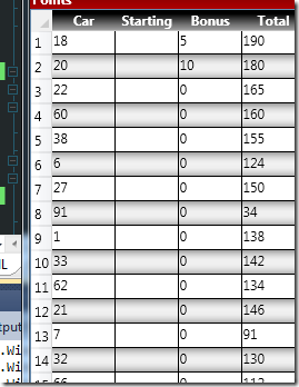
The result, a DataGrid with a row header for my rows that specifies the row number…that doesn’t get changed as my grid is sorted and resorted and resorted.

DataGridRowHeaders

WPF Date Range Double Slider Control (Part 1)

As I mentioned in my introduction to this series, I’m going over various aspects of how I created a DateTime Range slider control.  In this article, I’m going to be going over the basics of creating the user control.  Source for this project can be found on CodePlex.

First, to get two thumbs onto the slider, I overrode the control template of the regular slider with a template called “simpleSlider” to get rid of the track of each slider as well as some other default pieces of the base control template such as the repeater buttons.  With these things there, one or the other of the sliders would sit on top of the other and really just mess with my users’ experience.

Slider Control Template
  1. <ControlTemplate x:Key=“simpleSlider” TargetType=”{x:Type Slider}>
  2.     <Border SnapsToDevicePixels=“true” BorderBrush=”{TemplateBinding BorderBrush} BorderThickness=”{TemplateBinding BorderThickness}>
  3.         <Grid>
  4.             <Grid.RowDefinitions>
  5.                 <RowDefinition Height=“Auto”/>
  6.                 <RowDefinition Height=“Auto” MinHeight=”{TemplateBinding MinHeight}/>
  7.                 <RowDefinition Height=“Auto”/>
  8.             </Grid.RowDefinitions>
  9.  
  10.             <Rectangle x:Name=“PART_SelectionRange”/>
  11.  
  12.             <Track x:Name=“PART_Track” Grid.Row=“1”>
  13.                 <Track.Thumb>
  14.                     <Thumb x:Name=“Thumb” Style=”{StaticResource ResourceKey=HorizontalSliderThumbStyle} />
  15.                 </Track.Thumb>
  16.             </Track>
  17.         </Grid>
  18.     </Border>
  19. </ControlTemplate>


Then my control is made with the two sliders that use the “simpleSlider” template and a single Border control to be my track for the two sliders:

DateTime Range Slider
  1. <Grid VerticalAlignment=“Center” Background=“Transparent”>
  2.     <Border BorderThickness=“0,1,0,0” BorderBrush=“DarkGray” VerticalAlignment=“Bottom” Height=“1” HorizontalAlignment=“Stretch”
  3.            Margin=“0,0,0,10”/>
  4.  
  5.     <Slider x:Name=“LowerSlider” VerticalAlignment=“Top” IsEnabled=”{Binding ElementName=root, Path=IsLowerSliderEnabled, Mode=TwoWay}
  6.            Minimum=”{Binding ElementName=root, Path=Minimum, Converter={StaticResource ResourceKey=dtdConverter}}
  7.            Maximum=”{Binding ElementName=root, Path=Maximum, Converter={StaticResource ResourceKey=dtdConverter}}
  8.            Value=”{Binding ElementName=root, Path=LowerValue, Mode=OneWay, Converter={StaticResource ResourceKey=dtdConverter}}
  9.            Template=”{StaticResource simpleSlider}
  10.            Margin=“0,0,10,0”
  11.            SmallChange=”{Binding ElementName=root, Path=SmallChange, Converter={StaticResource ResourceKey=timespanToDoubleConverter}}
  12.            LargeChange=”{Binding ElementName=root, Path=LargeChange, Converter={StaticResource ResourceKey=timespanToDoubleConverter}}
  13.             />
  14.  
  15.     <Slider x:Name=“UpperSlider” IsEnabled=”{Binding ElementName=root, Path=IsUpperSliderEnabled, Mode=TwoWay}
  16.            Minimum=”{Binding ElementName=root, Path=Minimum, Converter={StaticResource ResourceKey=dtdConverter}}
  17.            Maximum=”{Binding ElementName=root, Path=Maximum, Converter={StaticResource ResourceKey=dtdConverter}}
  18.            Value=”{Binding ElementName=root, Path=UpperValue, Mode=OneWay, Converter={StaticResource ResourceKey=dtdConverter}}
  19.            Template=”{StaticResource simpleSlider}
  20.            Margin=“10,0,0,0”
  21.            SmallChange=”{Binding ElementName=root, Path=SmallChange, Converter={StaticResource ResourceKey=timespanToDoubleConverter}}
  22.            LargeChange=”{Binding ElementName=root, Path=LargeChange, Converter={StaticResource ResourceKey=timespanToDoubleConverter}}
  23.             />
  24. </Grid>


Mainly because I didn’t want to spend the time (at this point) dealing with making this a slider that could handle more than just a DateTime range, the Minimum, Maximum, and Value properties of the sliders are using an IValueConverter to handle the conversion between the doubles the sliders expose to DateTime values.  The SmallChange and LargeChange properties are converted from TimeSpans my control expects to doubles that the slider controls expect.

DateTime to Double Converter
  1. public class DateTimeDoubleConverter : IValueConverter
  2. {
  3.     public object Convert(object value, Type targetType, object parameter, System.Globalization.CultureInfo culture)
  4.     {
  5.         DateTime dt = DateTime.Parse(value.ToString());
  6.         return dt.Ticks;
  7.     }
  8.  
  9.     public object ConvertBack(object value, Type targetType, object parameter, System.Globalization.CultureInfo culture)
  10.     {
  11.         double d = double.Parse(value.ToString());
  12.         return new DateTime((long)d);
  13.     }
  14. }
TimeSpan to Double Converter
  1. public class TimeSpanToDoubleConverter : IValueConverter
  2. {
  3.     public object Convert(object value, Type targetType, object parameter, System.Globalization.CultureInfo culture)
  4.     {
  5.         TimeSpan givenValue = (TimeSpan)value;
  6.         return givenValue.Ticks;
  7.     }
  8.  
  9.     public object ConvertBack(object value, Type targetType,
  10.        object parameter, System.Globalization.CultureInfo culture)
  11.     {
  12.         return new TimeSpan(((long)value));
  13.     }
  14. }